11 Things Every Dental Homepage Needs Above the Fold to Turn Visitors Into Booked Patients
The 11 things a dental homepage needs in the first screen to turn mobile visitors into booked patients, plus speed and accessibility basics.

- The first screen must answer who you are, where you are, and how to book — in seconds.
- Click-to-call and online booking should be visible on mobile without scrolling.
- Real photos, reviews and credentials build trust faster than stock imagery.
- Speed and accessibility are conversion factors, not just technical checkboxes.
Most patients decide within seconds whether to call, keep scrolling or go back to search results. On a phone, the first screen of your homepage — what appears “above the fold” — carries most of that decision. Yet many dental homepages spend it on a rotating slider, a stock photo and a vague tagline.
This checklist covers the 11 elements that belong in the first screen, how to fit them on mobile, and the speed and accessibility basics practices in Texas, Florida and California should not skip.
The 11 Essentials
What should a dental homepage show above the fold?
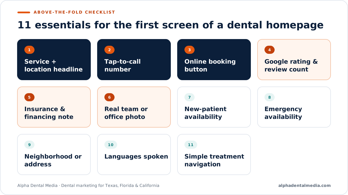
A clear headline naming your service and location, a one-tap call button, an online booking button, your rating and review count, insurance or financing reassurance, and a real photo of your team or office. Together, these answer the patient’s three questions: can they help me, can I trust them, and how do I book?
| # | Element | Why it matters |
|---|---|---|
| 1 | Headline with service and location | Confirms the patient is in the right place |
| 2 | Click-to-call phone number | Most urgent dental intent ends in a call |
| 3 | Online booking button | Lets patients book after hours |
| 4 | Google rating and review count | Social proof before they scroll |
| 5 | Insurance and financing note | Removes the most common objection |
| 6 | Real team or office photo | Builds familiarity and trust |
| 7 | New-patient availability | Signals they can be seen soon |
| 8 | Emergency availability (if offered) | Captures urgent searches |
| 9 | Neighborhood or address | Confirms distance and convenience |
| 10 | Languages spoken | Essential in bilingual markets |
| 11 | Simple navigation to treatments | Lets research-stage patients go deeper |
What makes a good dental homepage headline?
A specific promise that names the service and place, such as “Family and Cosmetic Dentistry in Katy, TX — New Patients Welcome.” Avoid vague slogans like “Creating Beautiful Smiles,” which don’t tell patients or search engines what you offer or where.
Should the phone number be clickable on a dental website?
Yes. On mobile, the phone number should be a tap-to-call button that stays visible as the patient scrolls. Many dental patients, especially with urgent needs, would rather call than fill out a form.
Do online booking buttons increase dental appointments?
Online booking gives patients a way to schedule outside office hours, when many people research providers. Place it beside the call button so patients can choose, and make sure the booking flow works smoothly on phones.
Trust Signals That Convert
Why should dentists use real photos instead of stock images?
Patients want to see who will treat them. Real photos of your dentists, team and office build familiarity and trust, while generic stock images can make a practice feel interchangeable. Use professional, well-lit photos with descriptive alt text.
Where should reviews appear on a dental homepage?
Show your Google rating and review count in the first screen, then feature a few recent, genuine review excerpts lower on the page. Never edit reviews or present invented testimonials; display real reviews with permission and attribution.
Should a dental homepage mention insurance and financing?
Yes. Cost and coverage are among the biggest reasons patients hesitate. A short line such as “Most PPO plans accepted · Flexible financing available” — only if true — removes an objection before it stops the call.
Mobile, Speed and Accessibility
How should a dental homepage look on mobile?
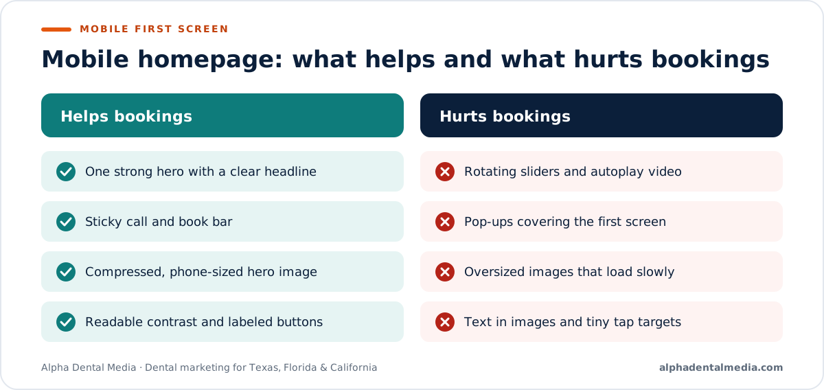
On a phone, prioritize the headline, call button, booking button and rating in the first screen, and keep a sticky call-and-book bar at the bottom. Remove sliders, autoplay video and pop-ups that push essential actions below the fold.
Mobile checklist:
- Headline readable without zooming
- Call and booking buttons at least 44px tall
- No pop-up covering the first screen
- Sticky call/book bar while scrolling
- Hero image compressed and sized for phones
Does website speed affect dental patient conversions?
Yes. Slow pages frustrate patients and can cost them before they ever see your call button. Google’s Core Web Vitals measure loading, responsiveness and visual stability; keeping hero images small and avoiding heavy sliders helps all three.
| Core Web Vital | What it measures | Common dental-site cause of problems |
|---|---|---|
| Largest Contentful Paint | How fast the main content loads | Oversized hero images and sliders |
| Interaction to Next Paint | How quickly the page responds | Heavy chat widgets and scripts |
| Cumulative Layout Shift | Visual stability | Banners and images loading late |
Do dental websites need to be accessible?
Accessibility helps every patient, including people with visual, motor or cognitive disabilities, and website accessibility lawsuits have been common in states like California and Florida. The U.S. Department of Justice has published guidance on web accessibility under the ADA. Follow WCAG guidelines for contrast, labels, alt text and keyboard navigation.
Homepages in Texas, Florida and California
What should dental homepages emphasize in major metros?
Location clarity and language access. In sprawling Texas metros, name the neighborhood and nearby areas you serve. In bilingual markets like Miami, San Antonio and Los Angeles, show the languages your team speaks and offer a Spanish version of key content.
| Market | Above-the-fold priority |
|---|---|
| Houston, Dallas–Fort Worth | Neighborhood name and nearby communities served |
| San Antonio, Miami, Los Angeles | “Se habla español” and a language switcher, if accurate |
| Orlando, Tampa | Emergency and same-day availability, if offered |
| San Francisco Bay Area, San Diego | Credentials, technology and transparent financing |
Are there advertising rules for offers on a dental homepage?
Yes. State dental boards regulate advertising claims. Florida requires a specific disclaimer when advertising free or discounted services or exams, so a “Free New-Patient Exam” banner needs that statement. Review homepage offers against your state’s rules.
Below the Fold: What Comes Next
What should a dental homepage include below the first screen?
After the first screen, help research-stage patients go deeper: featured treatments, meet-the-team, real reviews, insurance and financing details, office locations with maps, and answers to common questions. Repeat the call and booking options after each major section.
A proven order for the rest of the page:
- Featured treatments with short descriptions and links
- Meet the dentists, with credentials and photos
- Real Google review excerpts with attribution
- Insurance accepted and financing options
- What to expect at your first visit
- Office locations, hours, parking and directions
- Frequently asked questions
- A final call-to-action band
Should a dental homepage use a slider?
Usually not. Rotating sliders slow pages, push key information out of view and are rarely seen past the first slide. A single strong hero with a clear headline, real photo and action buttons is faster and more effective.
Do chat widgets help dental websites convert?
They can help if someone actually answers quickly, but slow or heavy widgets can hurt page speed and cover important buttons on mobile. Test whether chat produces booked appointments and load it after the main content.
| Feature | Helps when | Hurts when |
|---|---|---|
| Live chat | Staff respond in minutes | Messages go unanswered |
| Pop-up offer | Shown after engagement, easy to close | Covers the first screen on mobile |
| Autoplay video | Rarely | Slows loading and distracts |
| Online booking | Real availability shown | Booking flow breaks on phones |
What are the most common dental homepage mistakes?
Vague headlines, hidden phone numbers, stock photos, slow sliders, pop-ups covering the first screen, outdated hours and missing insurance information. Each adds friction at the moment a patient is deciding whether to call.
- Headline names your service and location
- Call and booking visible without scrolling
- Real photos with descriptive alt text
- Hours and address current and consistent
- Page loads quickly on a phone
How do I test whether my dental homepage works?
Watch real data: calls and bookings from the website, mobile conversion rate and where visitors drop off. Then ask a few people unfamiliar with your practice to find your phone number, insurance information and booking option on a phone, and note where they hesitate.
How should a multi-location practice design its homepage?
Help patients reach the right office quickly. Show a simple location selector or office cards near the top, each with the neighborhood, phone number and booking link, and give every office its own detailed location page. Avoid forcing patients to read about every office before they can call one.
In sprawling metros such as Houston or Dallas–Fort Worth, listing the communities each office serves helps patients recognize which location is closest.
Should a dental homepage show prices or special offers?
A clear new-patient offer or financing message can help, but it must be accurate and compliant with your state’s advertising rules. Detailed pricing usually belongs on treatment pages, where you can explain what affects cost. Keep the homepage focused on trust and the next step.
If you advertise a free or discounted exam in Florida, include the disclaimer the state requires wherever the offer appears.
Wherever offers appear, keep the terms visible and easy to read on mobile, not hidden behind a tap.
What should the homepage say about new patients?
Make it obvious that you’re accepting new patients and what happens next. A short line such as “Accepting new patients — appointments available this week,” only if true, plus a link to a new-patient page explaining the first visit, forms and insurance, removes uncertainty for people choosing a dentist for the first time.
A good new-patient page linked from the homepage covers:
- What happens at the first visit and how long it takes
- What to bring: ID, insurance card, medication list
- Online forms patients can complete before arriving
- Accepted insurance plans and financing options
- Parking, accessibility and directions
- A booking button and phone number
For anxious patients, mentioning comfort options — sedation, headphones, a gentle approach — can be the detail that turns a visit into a booking.
What to Expect
How quickly can homepage changes improve bookings?
Above-the-fold improvements take effect as soon as they launch, so you can compare calls and bookings within a few weeks. Measure before and after using call tracking and booking data rather than relying on traffic alone.
| Phase | Timeframe | Focus |
|---|---|---|
| Baseline | Week 1 | Record calls, bookings and mobile conversion rate |
| Redesign first screen | Weeks 2–3 | Headline, buttons, trust signals, speed fixes |
| Measure | Weeks 4–8 | Compare conversions; fix friction points |
| Refine | Ongoing | Test headlines, offers and booking flow |
The Bottom Line
Your homepage’s first screen has one job: help a patient decide to contact you. Name your service and neighborhood, make calling and booking effortless on a phone, show real people and real reviews, and remove anything that slows the page or hides the next step. Then measure calls and bookings and keep refining.
Sources
- Google Search Central — Understanding Core Web Vitals
- U.S. Department of Justice — Guidance on Web Accessibility and the ADA
- W3C — Web Content Accessibility Guidelines (WCAG) overview
- Florida Statutes — §456.062, Advertisement of free or discounted services
Disclaimer: This article is for general educational purposes and is not legal advice. Website performance and conversion results vary by practice and market, and no outcome is guaranteed. Consult a qualified attorney about accessibility and advertising compliance, and a qualified web professional before significant site changes.